As the days lengthen and nature awakens, many homeowners feel a strong urge to refresh their living spaces. Embracing the season’s vibrancy with new aesthetics is a wonderful way to welcome change. Therefore, understanding the perfect spring home decor color palettes becomes essential for transforming your home. These palettes bring a sense of renewal and freshness, perfectly reflecting the beauty outside. Discovering the right colors can truly revitalize any room.
Embracing the Vibrancy of Spring Home Decor Color Palettes
Spring home decor color palettes are more than just pretty shades; they are an invitation to infuse your environment with life and energy. These carefully curated collections of colors evoke feelings of growth, lightness, and optimism. They often draw inspiration directly from the natural world around us. Think about the first blossoms and green shoots emerging after winter.
Choosing the right palette involves balancing traditional spring hues with modern trends. This ensures your home feels both timeless and current. Furthermore, a well-chosen palette can significantly impact your mood and the overall ambiance of your living space. It truly sets the tone for the season. We will explore various options to help you achieve this.
What Defines Spring Home Decor Color Palettes?
Spring palettes are typically characterized by their lightness and freshness. They move away from the deep, rich tones of winter, embracing softer, more airy shades. However, this does not mean they lack depth or personality. Instead, they offer a gentle yet impactful transformation.
Key elements often include pastels, bright pops of color, and natural greens. These elements work together to create a harmonious and inviting atmosphere. Consider the feeling of a bright, sunny day or a blossoming garden. The goal is to bring that feeling indoors, making your home a sanctuary of seasonal beauty.
Classic Spring Home Decor Color Palettes: Timeless & Fresh
Some spring home decor color palettes remain perennially popular due to their inherent beauty and versatility. These classic combinations offer a reliable foundation for any spring refresh. They provide a sense of comfort and familiarity while still feeling utterly fresh. Many homeowners gravitate towards these tried-and-true options.
These palettes often echo traditional spring imagery, making them instantly recognizable and appealing. They are easy to incorporate into various design styles, from farmhouse to traditional. Furthermore, their timeless appeal means they will look beautiful for years to come. You can never go wrong with a classic.
Soft Pastels & Blossoms: A Gentle Awakening
The delicate charm of soft pastels is synonymous with spring’s gentle awakening. Think about shades like blush pink, baby blue, mint green, and lavender. These colors create a serene and calming environment. They are perfect for bedrooms or living areas where relaxation is key.
- Blush Pink: Adds warmth and a touch of romance.
- Baby Blue: Evokes clear skies and tranquility.
- Mint Green: Represents new growth and freshness.
- Lavender: Offers a soothing, aromatic feel.
You can easily incorporate these hues through throw pillows, light curtains, or fresh floral arrangements. For instance, a vase of peonies or hydrangeas instantly brightens a room. This approach allows for subtle yet impactful changes. Additionally, these colors pair beautifully with neutral backdrops.
Fresh Greens & Earth Tones: Bringing Nature Indoors
Connecting with nature is a core aspect of spring design. Incorporating fresh greens and grounding earth tones creates a harmonious, organic feel. Sage green, olive, moss, and various shades of brown or terracotta bring the outdoors in. This palette offers a sense of stability and natural beauty.
These colors work wonderfully in spaces where you want to feel connected to the natural world. Consider using them in a sunroom or a cozy reading nook. They create a calming and restorative atmosphere. Furthermore, incorporating natural materials like wood, rattan, and linen enhances this earthy aesthetic. for more ideas on biophilic design.
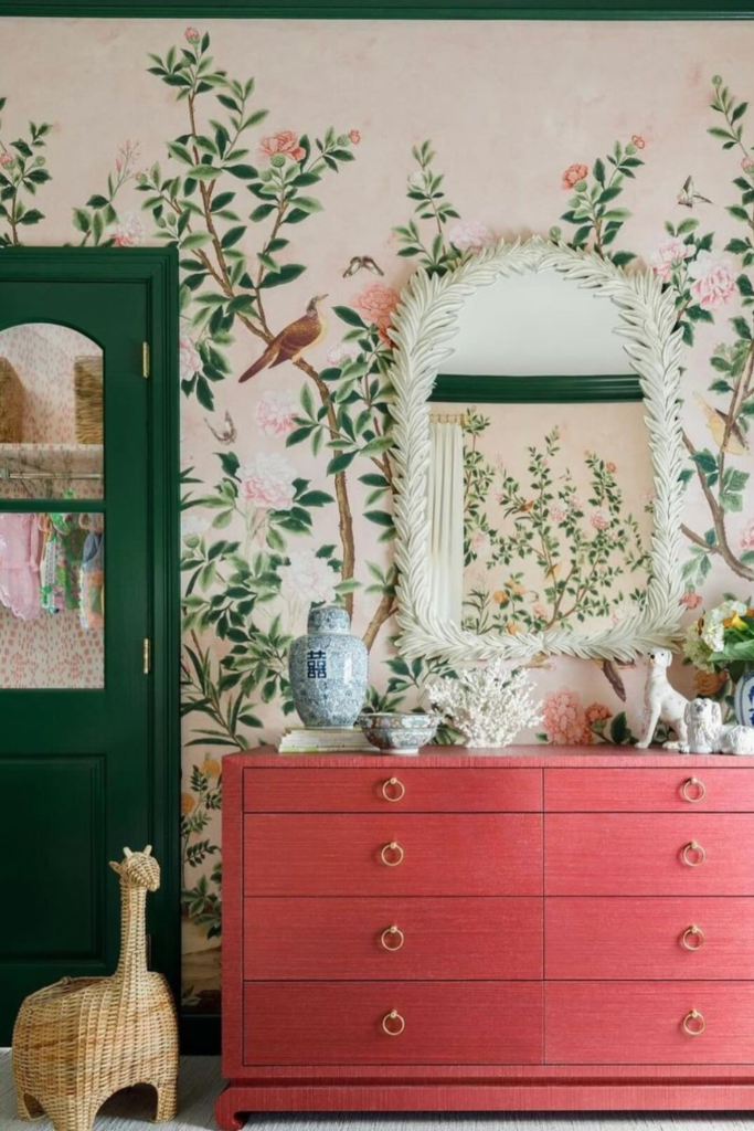
Sunny Yellows & Sky Blues: Capturing Brightness
Nothing says spring quite like the cheerful combination of sunny yellows and expansive sky blues. This vibrant pairing instantly brightens any room, reflecting the clear, sunny days of the season. It injects a dose of optimism and energy. This palette is perfect for creating an uplifting atmosphere.
Use sunny yellows for accent pieces like cushions, vases, or artwork. Complement these with sky blue textiles or decorative items. This balance prevents the space from feeling overwhelmed. Moreover, these colors are known to boost mood and creativity. They are ideal for kitchens or home offices.
Modern & Minimalist Spring Home Decor Palettes for Contemporary Spaces
For those who prefer a more streamlined aesthetic, modern and minimalist spring home decor color palettes offer sophisticated options. These palettes focus on subtle shifts and strategic pops of color. They maintain a clean, uncluttered feel while still embracing the spirit of spring. This approach proves both elegant and refreshing.
These contemporary palettes often feature muted tones as a base, allowing spring accents to truly shine. They create a sense of calm and order, which is highly desirable in modern living. Furthermore, they are incredibly versatile and can be adapted to various architectural styles. They offer a refined take on seasonal decor.
Greige & Muted Neutrals with Strategic Pops of Color
Greige, a sophisticated blend of grey and beige, forms an excellent neutral base for modern spring decor. Muted neutrals like soft creams and warm off-whites also work beautifully. These foundational colors provide a serene backdrop. They allow vibrant spring accents to stand out effectively.
Consider adding strategic pops of color with items such as a single bright yellow vase or a set of coral throw pillows. This method introduces spring’s freshness without overwhelming the minimalist aesthetic. Therefore, the overall look remains clean and refined. This balance is key to modern spring design.
Monochromatic Greens & Blues: Sophisticated Serenity
A monochromatic approach using varying shades of green or blue can create a deeply sophisticated and serene spring palette. Think about layering different tones of sage, mint, and forest green. Alternatively, explore light blue, teal, and navy for a cool, calming effect. This technique adds depth without introducing too many colors.
This palette works exceptionally well in bedrooms or bathrooms, promoting a tranquil atmosphere. It feels both modern and timeless, offering a sense of understated elegance. Moreover, incorporating different textures within the same color family enhances visual interest. This creates a rich, layered look.
Choosing Your Ideal Spring Home Decor Color Palette
Selecting the perfect spring home decor color palette is a personal journey. It involves considering various factors unique to your home and preferences. This thoughtful process ensures your chosen colors truly enhance your living space. Ultimately, the goal is to create a home that feels authentically yours for the season.
Do not rush this decision; instead, take time to explore different options. Consider how various colors make you feel and how they interact with existing elements. This careful consideration will lead to a more satisfying result. Furthermore, remember that small changes can make a big impact. You don’t need a complete overhaul.
Considering Your Home’s Existing Style & Light
Before committing to a new palette, assess your home’s current style and natural light. A brightly lit room can handle bolder colors, while a darker space might benefit from lighter, reflective shades. Your existing furniture and permanent fixtures also play a crucial role. They provide a base for your new spring additions.
For example, if your home has a rustic charm, earthy greens and soft yellows might integrate seamlessly. Conversely, a contemporary home might suit cleaner blues and crisp whites. Consider the fixed elements in your home, such as flooring, wall colors, and large furniture pieces. These elements should guide your choices.
Understanding Color Psychology for Spring Moods
Colors have a profound impact on our emotions and perceptions. Understanding color psychology can help you choose a spring palette that evokes the desired mood. Yellows often symbolize happiness, while greens represent growth and tranquility. Blues typically convey calmness and serenity.
Think about the feeling you want to cultivate in each room. Do you want a vibrant, energetic kitchen or a peaceful, relaxing bedroom? Aligning your color choices with these emotional goals creates a more intentional and effective design. This thoughtful approach enhances your home’s overall atmosphere.
Practical Tips for Incorporating New Spring Hues
Incorporating new spring hues does not always require a major renovation. There are many simple, practical ways to introduce fresh colors. Start with smaller, less permanent items to test out your chosen palette. This allows for flexibility and experimentation.
- Textiles: Update throw pillows, blankets, and curtains in spring colors.
- Accessories: Add vases, decorative bowls, and candles in your chosen palette.
- Artwork: Introduce new prints or paintings featuring spring themes and colors.
- Fresh Flowers: Bring in seasonal blooms like tulips, daffodils, or hyacinths.
- Small Furniture: Consider an accent chair or stool in a vibrant spring shade.
Remember, even a few well-placed items can significantly change a room’s feel. Experiment with different combinations until you find what truly resonates with you. Furthermore, don’t be afraid to mix and match textures for added visual interest. This creates a dynamic and inviting space.
For additional inspiration on color theory and its application in interiors, explore resources like Wikipedia’s page on Color Theory.
Frequently Asked Questions About Spring Home Decor Color Palettes
What are the most popular spring home decor color palettes this year?
This year, popular spring home decor color palettes lean towards a blend of soft, nature-inspired hues and cheerful, optimistic tones. Think about calming sage greens, serene sky blues, and warm terracotta. Additionally, vibrant pops of coral and sunny yellow are trending. These palettes offer both tranquility and a burst of energy, reflecting a desire for balance and joy.
How can I incorporate spring colors without repainting my entire home?
You can easily incorporate spring colors without repainting by focusing on accessories and textiles. Start with throw pillows, blankets, and curtains in your desired spring shades. Add fresh flowers, decorative vases, and artwork. Even changing out hand towels or placemats can make a noticeable difference. These smaller items allow for flexible and budget-friendly updates.
What’s the difference between spring and summer color palettes?
Spring color palettes often feature softer pastels and vibrant, yet gentle, hues that evoke new growth and freshness. They are about renewal and awakening. Summer palettes, conversely, tend to be bolder, more saturated, and brighter, reflecting the intensity of the summer sun and ocean. Think about electric blues, vivid fuchsias, and strong primary colors for summer, compared to mints, blushes, and soft yellows for spring.
How do I choose a spring color palette that suits my personal style?
To choose a spring color palette that suits your personal style, first consider the existing decor and your personal preferences. Do you prefer calm and serene, or bold and energetic? Look at your wardrobe or favorite art for clues about your color leanings. Create a mood board with images that inspire you. This visual guide helps solidify your choices and ensures the palette feels authentic to you.
Conclusion: Transform Your Space with Inspiring Spring Home Decor Color Palettes
Embracing the beauty of spring home decor color palettes is a delightful way to refresh your living environment. Whether you gravitate towards classic pastels, modern neutrals, or bold statements, there is a perfect palette waiting to revitalize your home. These thoughtful color choices can significantly impact your mood and the overall ambiance of your space. They truly bring the essence of spring indoors.
We encourage you to experiment with different hues and textures to create a home that feels vibrant and welcoming. Let the season’s natural beauty inspire your design decisions. Start small, have fun, and watch your home transform into a sanctuary of spring joy. Share your favorite spring decor ideas in the comments below!